In week 2, I created a mind map focused on Access to Arts and Culture where the scenario presented the challenge around establishing data analysis to help find access blindspots that can be immediately addressed. The mind map explored many potential barriers to entry with engaging with the arts, be they awareness, monetary or proximity barriers. For this assignment, I’m diving deeper into these questions by curating data visualizations through two lenses I think are critically important to understanding access to the arts. These lenses are contributing to the arts and consuming the arts. And both lenses will be viewed within a monetary-based framework for accessing arts and culture. While monetary challenges to accessing arts and culture aren’t the only known barrier, I think it’s a great place to start with a lot of data to evaluate.
Contextual data
There are nearly as many ways to consume art and culture as there are to create them, but for this curation I’ll be looking at more events-based methods of arts consumption because I feel they are the most approachable to the broadest amount of people. Additionally, purchasing arts products varies a great deal from medium to medium and would require many more visualizations than the two below.
Art Museum Ticket Prices
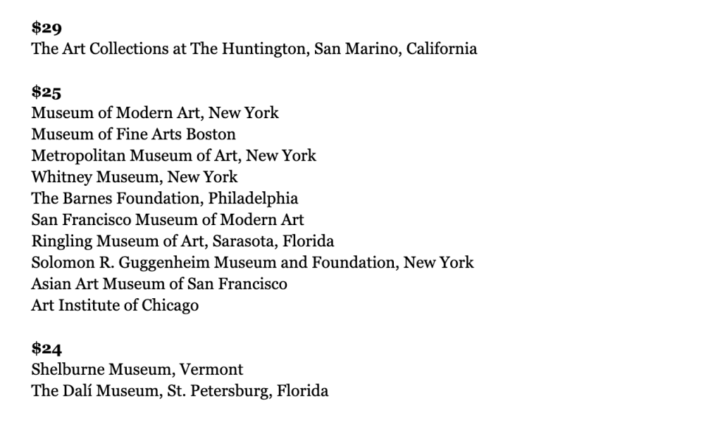
The above visualization by ARTnews in an article titled “From $29 to Absolutely Free: More than 200 U.S. Art Museums by Admission Price” is a rudimentary data visualization, a list. This visualization is helpful in understanding the contextual cost to participating and consuming the arts through the museum. I think this visualization could be better presented in a table where the prices are columns and museum names would fill in each of the rows. I think you could also represent the data by geographic region or even city–creating a Mekko Chart where the X-axis would present the regions and the Y-axis presents the price blocks, $25, $24, etc. Then each Bar would illustrate the number of museums within each price category to compare region to region. You could also, given enough space and design resources, present the names of each institution within the bars.
Consumer Price Index for All Urban Consumers: Admission to Movies, Theaters, and Concerts in U.S. City Average

Here, we have the Consumer Price Index around movie, theater and concert admission costs–another vitally important measure of showing the cost of tickets over the past 20 years. The increasing trend line could help us determine where the hurdle to consuming arts exists.
Tuition Cost Comparison

And here we have an overview of Art School Tuition costs, giving the viewer an idea for how much it costs to become an arts contributor through institutional means. The data table here shows the prices for well-known institutions, but the source below provides an overview of how much tuition and fees cost on average at both private and state colleges for in-state and out-of-state students.
Deeper data
Artist employment and wage data


Source: U.S. Bureau of Labor Statistics
Staying within the contributor lens, the above visualizations provide a detailed overview of expected wages for artists as well as employment distribution to help us understand where exactly artists could potentially live and thrive in the United States. We also gain an understanding of the return on investment between the average college tuition and the expected wages. One thing not included in the two above visualizations, but could be helpful in expanding them would be to provide information around the cost of living for each state, so that we can better understand the relationship between average wages and costs.
Average household budget

For the arts consumers, looking at the average household budget will help us assess how much money is available for entertainment. To further expand this visualization, it would be helpful to include details on how the entertainment budget is spent with an overview of the spending categories, such as streaming services, events and arts consumption. We see here that entertainment is 4% of the budget goes towards entertainment each year, which accounts to just over $2,500. Where does that all go? How can theater and art museum ticket prices compare?
The ideal visualization
Using all these data assets, I’d like to create an interactive map visualization to help communicate the monetary costs of both consuming and contributing to the arts–helping us understand the larger context of accessing arts and culture.
This would be an interactive map of the country that allows you to drill-down by county across the United States. When you select a county, you’d then be able to see the location of art institutions, such as colleges and venues, and their prices for admission/tuition. On the right side of the visualization, you’d be provided the following data points:
- Average cost of living and average budget
- Average income for all citizens
- Average income for artists in that county
- Art job availability for that county
- Number of venues
- Number of arts education venues
Through the interactive map, viewers would get a full cost of arts access and participation as well as the overall feasibility by ability to pay and afford the arts as well as opportunities to engage with the arts. Many questions around accessing the arts would be answered, including:
- How many venues are in this community?
- How many opportunities are there to engage with the arts?
- What does it pay to be an artist?
- What does it cost to become an artist?
- What does it cost to participate with the arts?
The visualization, by county, could look something like this if we were looking at Maricopa county:


Leave a comment